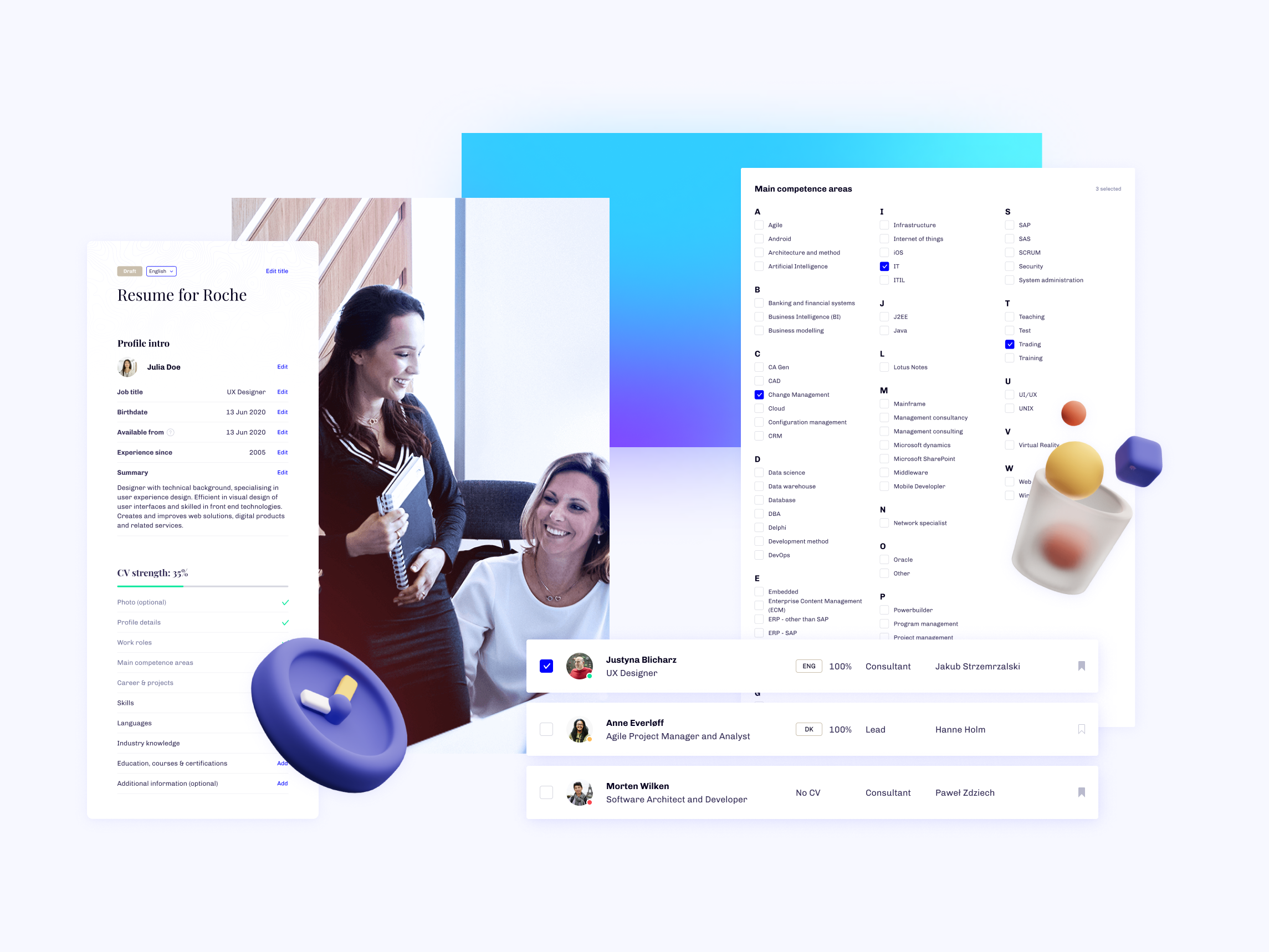
The IT startup industry is growing faster than ever and recruitment tools are more essential than ever.
Kandidate, as a startup, was in a hurry to improve existing experience and deliver to their customers. I was a product designer tasked to find a solution with the Kandidante’s design team.
Disclaimer: All views expressed here are my own and do not necessarily reflect the views of the respective company. Some design elements have been changed from the original.
My role
I was responsible for co-directing UX principles and designing UI guidelines for the web platform.
As a Product Designer, I was effectively responsible for filtering the UX research brought by a colleague, creating the user journey and designing it in guidelines created upon company’s request. I would on a daily basis talk with Product Owners, reviewing new tasks and delivering to developers designs in Figma.
As the work progressed, more features were added and redesigned–the product was created in agile methodology and POs requests were made based on user & client feedback.
RESPONSIBILITIES 🧔🏽
User journey, ideation, end-to-end prototype, UI guidelines
TIMELINE & OUTPUT ⏱
9 months of continuous work on product
TEAM 💃🏼🕺🏻
Product Owners (2), UX researcher, Tech Lead, Front & Back-end Developers
The environment 🛋
Before we go in-depth the designs, I want you to understand the unique environment. First of all, I was employed only half-time and felt as a part of Kandidante’s family. Frequent meetings and daily check-ins made the team my own.
The vision came from feedback
Every feature available in Kandidate’s backlog did not come from market research, like you would expect, but from users' requests. It was quite confusing for me.
Make it accessible
The Co-Founder of Kandidate was clear what he expected visually from the product–clean & accessible for any kind of user. The design solutions would have to engage a wide variety of people with different occupations, interests, and values.
Startup culture
The unique atmosphere of a startup was present in Kandidate. The team was always open for discussion and I was lucky to be part of it. Looking back, a frequent mess in workflow was easy to maintain because of the company's open attitude.
Design challenges
The challenge came mainly from the agile style of project management. Naturally there were goals to reach and strict deadlines, but we never knew when there would be a need to reopen tasks based on new user feedback. It was kinda annoying when creating UI guidelines and helped make the decision to keep-it-simple.
Who are the users?
As mentioned, the UX research & Feature review was in the hands of a colleague. As a team we discussed how we can redesign platform’s flow to meet their requests. The user base was made from Recruiters and Specialists, so that was very fortune when creating personas.
Because I was not directly responsible for interviewing and collecting data, my knowledge is very limited in this regard. From what I understood, the visitors of the Kandidate platform were mostly UK based, working as management in IT startups.
Creating a journey cognitively & visually was very easy for me–users basically requested simple to use set of recruitment tools.
What about the MVP?
Product Owners were always open to discuss why new features were developed and what was the Kandidate’s long-term motives. I can’t share with you product journey maps, because I wasn’t responsible for creating and maintaining them, but when it came to creating products, funders were always open to our suggestions.
When talking about MVP, we need first to discuss what is the role of Kandidate’s on the UK's market. In their own words:
I have nothing to add.
The MVP was a mirror of their values–fast onboarding and good understanding of candidates strengths and weaknesses. The flow was necessary to maintain, due to the unique formula created for the process. It was a really great experience working on a product that knows what it is, especially when the features were built to support it.
Accessible on every step 💡
The vision of how I should approach the designs was clear, yet leaving a lot of room for amazing concepts. I was excited working on a project that was aimed at a large, professional user base. In the beginning, the list of point to follow was made:
Don’t make me think
Just like Steve Krug writes in his book. The rules of common sense and web usability were the fundamentals of the Kandidate’s platform.
Stick to the rules
All components and user flows were designed with rules in mind. User should always know where he is, and how to get stuff done.
Step-by-step
The user journeys were based on step-by-step principles, that means if any action was made, the process would be split into easy to understand steps.
After giving myself strict rules to follow, I was ready to think, design and provide solutions for the team, to make the Kandidate number one recruitment procut on the market. Easier said than done!
Search, filter & chat
The biggest challenge came from the platform’s search functionalities. Filters were all over the place, with over 20 categories to choose from. That was the most requested task by the Kandidate team and I was happy to help.
Designs were updated with new guidelines with layout containing moving containers–that way there was always room on the left side for filters and search functionality when needed.
The filters were consolidated into cleaner and more friendly UI, tested for user’s most common screen resolutions. At the same time, the layout stayed almost the same as original designs, so the developers could focus more on updating the list of filters. The biggest improvement came from the research results–the process of redesigning cards took almost a month to complete and I think the results speak for themselves.
Sending the messages and “chat” functionalities were the second most requested product’s feature that needed an update.
The flow was revisited, discussed and made into a whole with very clean looking UIs. Fields order was decided based on their user research. Minimalistic approach made browsing and chatting with users a relaxed experience with principles mentioned earlier.
Make them focus
The user should have a reason to stay– there is nothing unusual about this, all products should be designed in a way so the current of future customers are willing to stay or come back in a not far interval of time. But how to do it?
There is no easy answer to this question, but I did my best to find a solution on this platform.
Starting with Wizard, the rule “step-by-step” is rocket to its maximum potential. User answers one question, then is taken to another, until the form is finished. This approach helps to focus, visualise and finish the process quicker than in the traditional “list” path.
The royal treatment 👑
The part of the redesign I was very fond of was the profile section. POs made a good point explaining why users are not using this functionality, based on the received feedback and how, from a business perspective, we can improve the experience for them.
Here you can see the before and after of the mentioned section:
Let’s start with the visuals. The principles mentioned before are still here–each component is self explanatory and interactive. UI guidelines are preserved in a form of clean and three dimensional design, so the users will focus on right elements.
In addition the journey is made in a way that when the new Kandidate members are done with wizard, they’re greeted with familiar functional solutions like profile details screen. Each part of the flow was designed to make the experience whole.
Stay informed
So what is “royal” about the profile’s redesign? First of all–a recruited specialist now has a reason to visit his profile’s dashboard on a daily basis. The “Manager salaris” and “Job that might interest you” were highlights of the new design and the response showed that the functionality was needed.
Even if the UX changes over the time to remove the recruiter’s identity, the UI proved to be very flexible and didn’t require any changes when some components were removed.
Expand your knowledge
The feature that was not implemented while I was employed in Kandidate, were courses and articles made by the team to “level-up” specialist’s knowledge. The users could find something new daily and received special badges, based on their activity.
The concept was discussed with the co-founder and put to the backlog due to Covid-19 situation and internal budget cuts.
Follow-ups 💌
The 9 months as Product Designer in Kandidate gave me an opportunity to update and upgrade some ideas and add factors that helped grow the company’s image. So were just landing pages to bring more users, and some requiring more cognitive approach.
The outcome was always met with praise or detailed feedback from team members.
Bringing more users
Part of the business plan was to gain more users with the “Startup salaries” website, which showed medium salaries in selected sectors and job types. Part of the functionalities were later used in profile pages inside the platform.
Updating the flow
Few functionalities, like search results, were expanded and updated to meet growing number of features and extended customer base.
The UI guidelines did exceptionally well while adding new components (like “New this month!”). The aim was always the same–Don’t make me think!
Outcome & retrospective 🤔
As mentioned, the months I spent as part of the Kandidate team were a great experience. It is unfortunate that I had to leave it to focus more on a full-time position as a leader–it was unfortunately tough for me to keep working two jobs and deliver quality solutions.
I learned a lot of new things, like how working in a UK startup is different from corporate, in approach from management and making decisions in ongoing projects.
Agile project management
Being used to Scram project management, going back to Agile was a bit unusual and trilling. Some requests came out from research conducted the day before and the whole team, like a well oiled machine, was able to deliver great live solutions within a week.
That gave me a new perspective on how some projects can benefit from Agile, if the mindset is there...
Startup environment
…and the startup culture is the best to work in this kind of project management. As it is to meet friends and do quality work, while having a lot to say on product. I missed some corporate aspects, like extremely detailed processes and doing everything in proper order, but the atmosphere made by coworkers was as unique and cool as it could be.
The PandeMIC
So why I’m not in the product designer position in Kandidate anymore? After the Covid-19 outbreak, the companies that fit in the UK market the most were startups. Cuts in the development team meant that the design task will also slow down.
From what I hear, the product is going strong and the entire team is growing after a few rough months.


