7N was experiencing increased corporate growth—and they needed a tailored IT platform to support it.
The management decided that the only reasonable way to meet the demand for management tools was to create it from scratch.
Team of talented designers and developers was made. I took a role of UI designer and UX consultant in creating a new product experience that helped grow our company.
Team of talented designers and developers was made. I took a role of UI designer and UX consultant in creating a new product experience that helped grow our company.
Disclaimer: All views expressed here are my own and do not necessarily reflect the views of the respective company. Some design elements have been changed from the original.
My role
I was responsible for everything UI: guidelines, hi-fi prototypes & interactions, as well as helping with the crafting and expanding user flow when needed.
The product went through two iterations over 3 years, so we had plenty of time to conduct research and deliver tested and pixel perfect solutions. The team assembled from three designers (UX & two UX/UI) & team of skilled software developers to code the product, was responsible to realize business needs from over 4 product owners(!).
We didn’t expect the project to grow outside the management tool MVP, to a large multifunctional platform gathering information about current and future consultants hired by 7N. It’s worth mentioning that the process didn’t have any kind of leader or proper IT manager in the beginning–it was addressed later as the requirements grew.
RESPONSIBILITIES 🧔🏽
Visual Guidelines, interactions & hi-fi prototyping
TIMELINE & OUTPUT ⏱
3 years to design a web based platform for over 1000 active users
TEAM 💃🏼🕺🏻
UX & UI Designers, Front & Back-end Developers and Product Owners
High-level goals 🥅
01–MAKE IT ACCESSIBLE
Large platforms can get confusing. Managers & employees needed something to guide them during onboarding and short &long-term employment evaluations.
02–Grand one tool for all
Collecting and managing user data can become frustrating when not taking both sides into consideration. It was crucial that our solution influence users to receive a relaxed experience.
03–enhance USERS feeling of value
How can we let users know that they’re specialists in a certain direction or topic? How might we give them a sense of accomplishment?
04–INCORPORATE Company Culture
We wanted to bring the 7N open-minded culture in one place, with simple chat & feedback functionalities.
Let's talk context
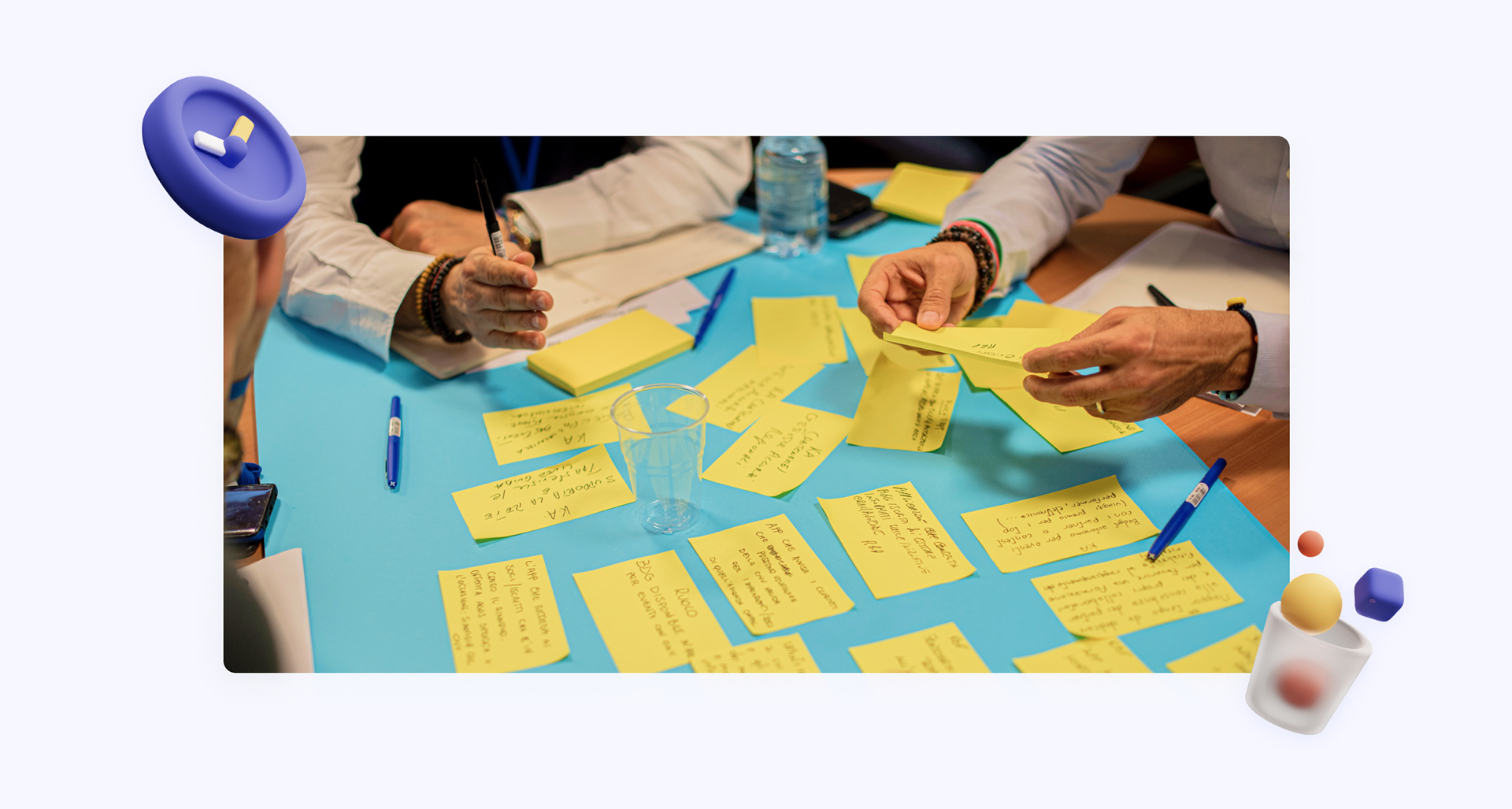
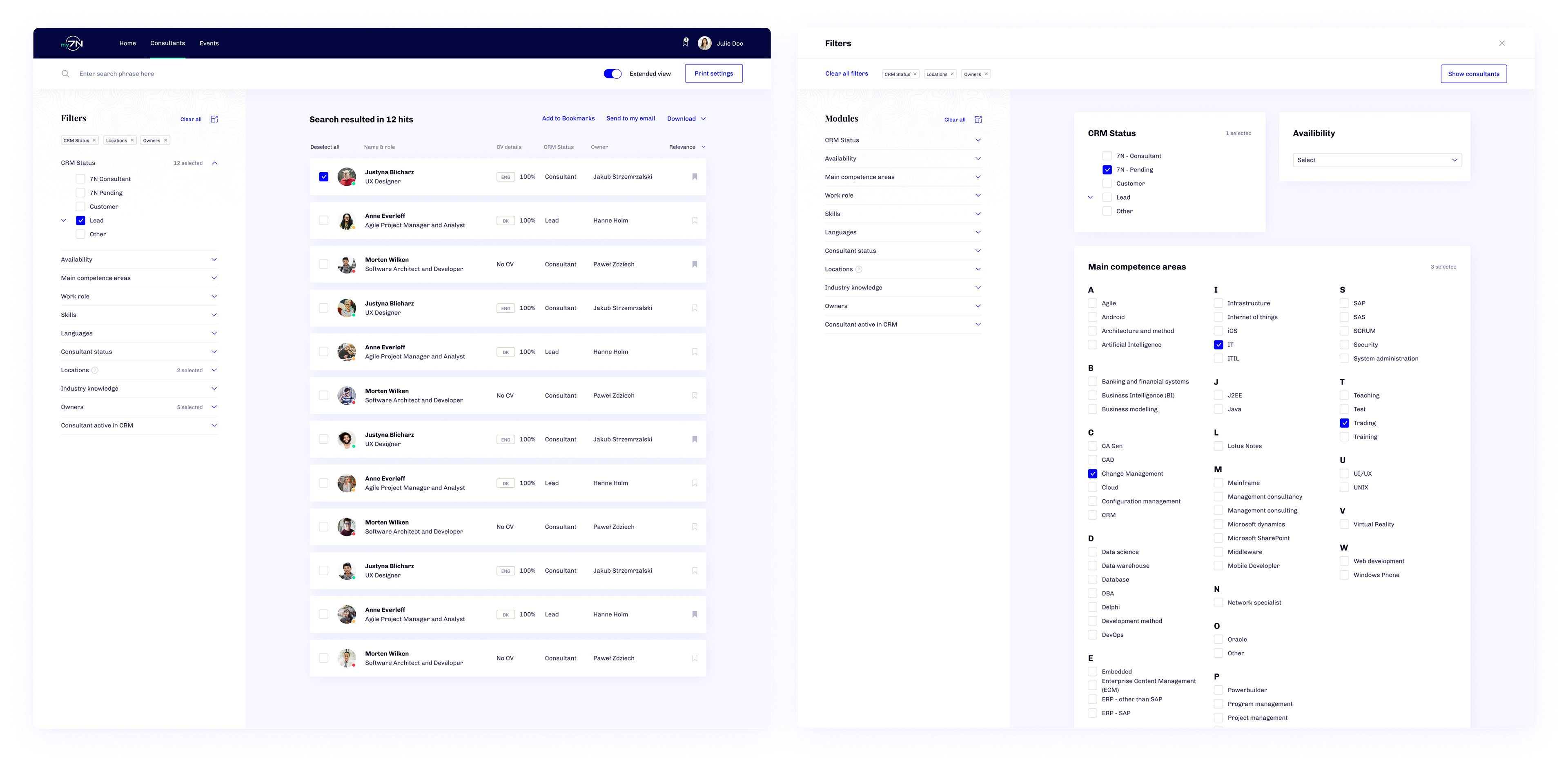
Understanding the environment in which the platform would exist was vital in setting the specifics of each user's journey through the event. The existing tool did not collect any user data and POs were not conducting periodic user satisfaction forms, so we stared with black sheet.
Due to having a large group of POs trying to incorporate their products into the platform, we had to research and interview real-life users in & outside our company’s organization.
Due to having a large group of POs trying to incorporate their products into the platform, we had to research and interview real-life users in & outside our company’s organization.
How we did the research?
The research process started with in-depth review of competitor's solutions. The consultation market was kind a unique digital sector back ten, focusing on simple forms and Excel-link solution where users are stored, so we quickly moved to user-based research. Our aim was always to review the POs requested features and find out what are the user needs for my7N.
Qualitative research was conducted with over 30 internal employees and consultant (hired on specific projects by 7N). Some of the questions were aimed directly to user personal needs like:
● How do you wish to be more attractive on the market as a consultant?
● Do you fell that 7N is giving you good tools to express yourself as a specialist?
● What is your experience of referring other specialist to 7N?
We also did fair share of quantitative research, that included sending a form to over 500 7N employees asking questions like:
● Do you find current recruitment process wizard easy?
● What would you like to see changed or updated in current digital process?
● What tools to you use today to express yourself as a specialist?
Based on our collected data we were able to create detailed personas with specific gains & pains. We also had great amount of information to confront POs ideas for features to start more detailed discussions.
Who are the users?
We used the consultant list to interview & draw the platform's expected users in & outside of the company. This along with discussions with the Product Owners provided the data we needed to create personas and prioritize features to support them.
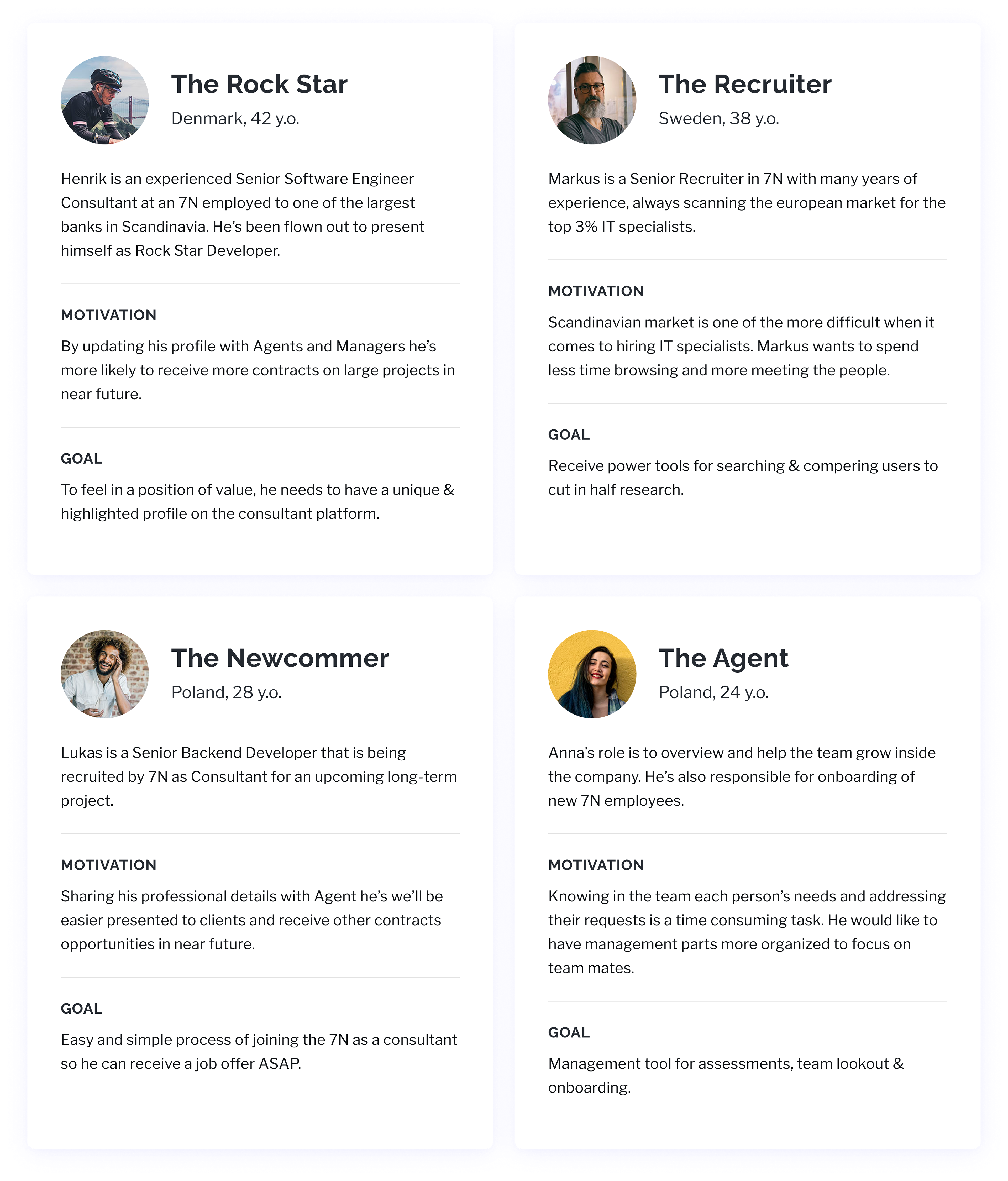
All four are an amalgamation of over 30 actual people the team had come in contact with during my time in The 7N. This made for better experience visualization and empathy on my part as I gauged each of my imagined reactions at certain touchpoints.
Most data providers would be employees of the company and their insights were on top of our list. We needed a platform that could continue to grow with us even after planned features are done. This meant structuring it in a way that could scale to accommodate smaller corporate decisions.
Most data providers would be employees of the company and their insights were on top of our list. We needed a platform that could continue to grow with us even after planned features are done. This meant structuring it in a way that could scale to accommodate smaller corporate decisions.
Linking the connections
Because I was responsible for visual guidelines, I took a role to observe, ask, occasionally suggesting changes and naturally trust my team with decisions. My position could be compared to a link between Design Thinking & Engineering, so if anything could expand time & development, it was suggested by me to give it a second look. Gladly, we had a continuous overview from Development Team Architect which cut our thinking process almost in half.
The flow created by our team of designers was top notch, with detailed prototypes and excellent cognitive maps. This would prove to be time-efficient, as well as effective in demonstrating interactions to POs.
The flow created by our team of designers was top notch, with detailed prototypes and excellent cognitive maps. This would prove to be time-efficient, as well as effective in demonstrating interactions to POs.
As mentioned, the project had two iterations. The first attempt was missing extended insights from future users and POs, so when approaching the project the second time a lot of things were planned ahead.
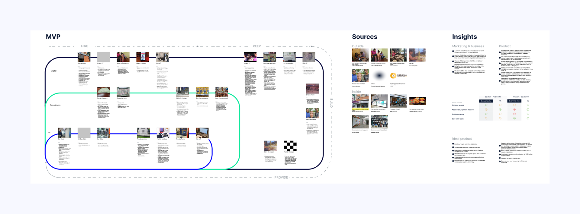
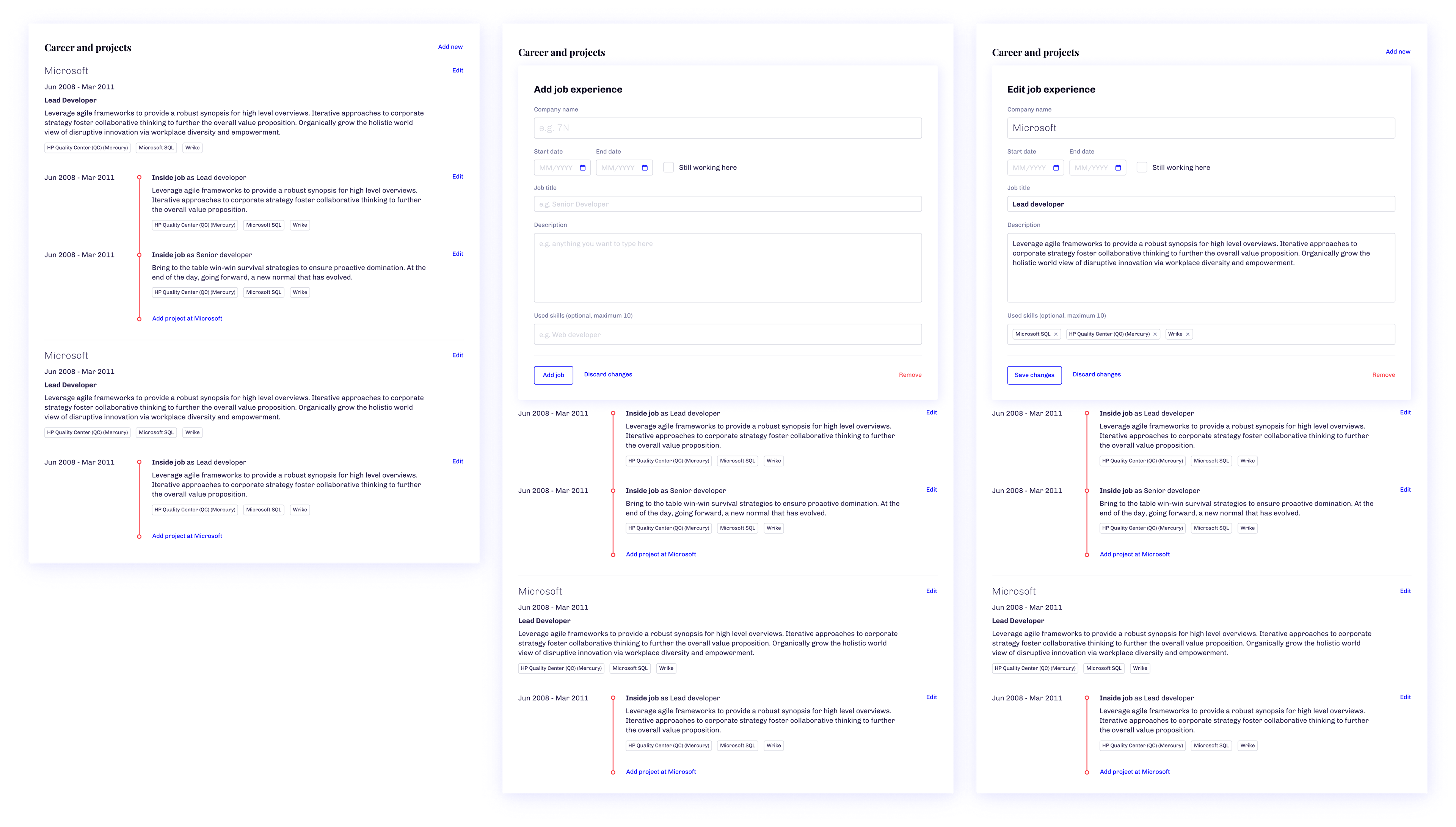
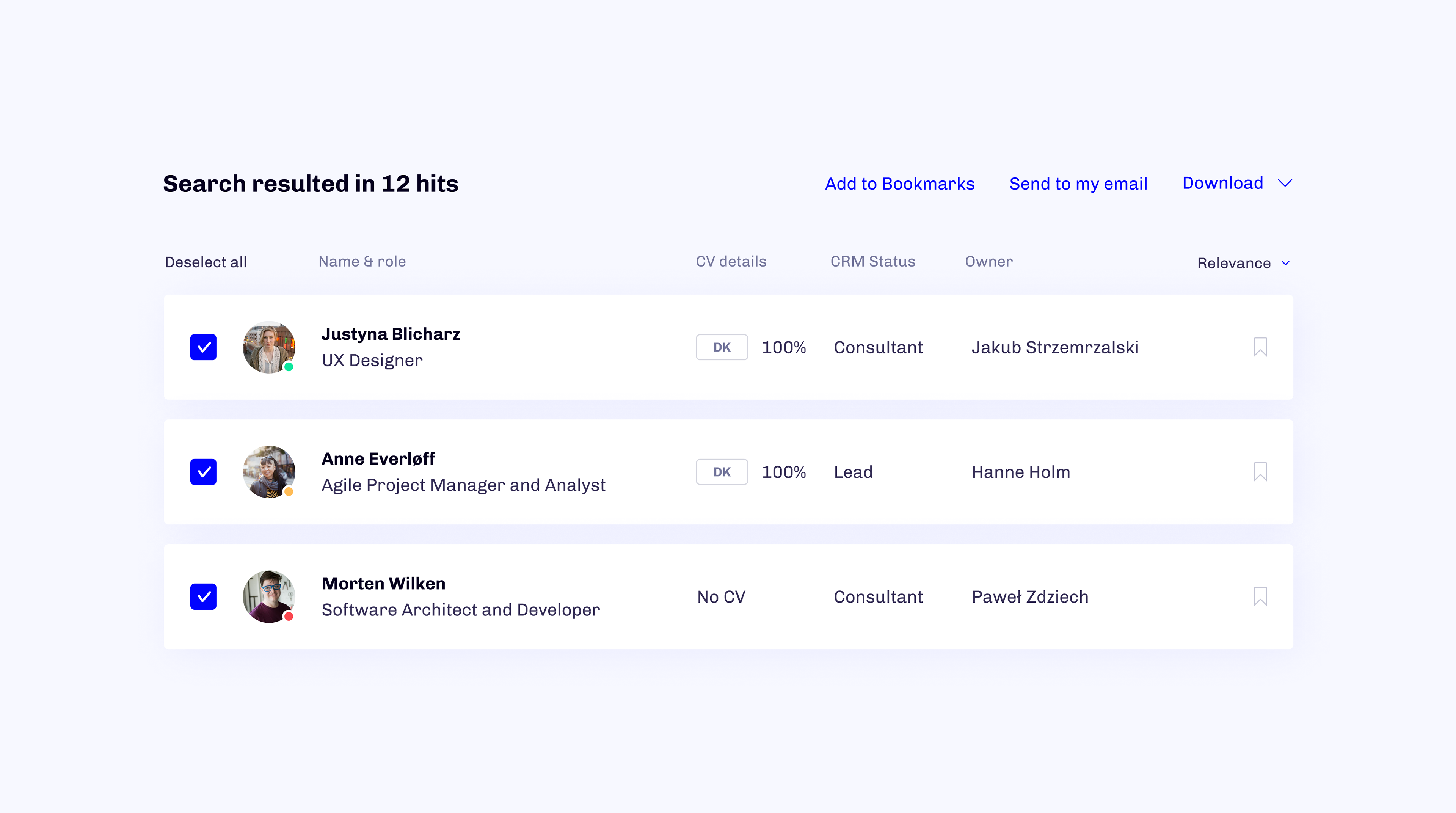
Each of the Product Owners had its goals and timelines for delivery. The MVP was self-explanatory, containing CV System & User Management System. The extended flow that contains every feature from POs, took us over a year to make.
To meet the deadlines, most of the extended features were halted to build the MVP. Working on UIs, keeping in mind the scope, was no minor task for me.
I enjoyed working on my7N project, thanks to the fluid environment where each team member was hyper-aware of the entire experience we wanted to create. Our excitement allowed us to approach each new idea with full dedication. We could assess the current user flows as a whole, making it easy to find and minimize gaps in the process.
It’s all black on white 🎲
Knowing the design will be mostyle text oriented, I restrained myself using unnecessary UI enhancements like iconography and focused on visual cues to communicate possible causes of action. 7N users are multinational groups from over 8 countries and 3 continents. Accessibility and inclusivity were a priority.
The decision to go with a clean, contrast oriented design on spot & connecting it with brand presence made it whole. Colours & typography were balanced and added as “web components” guidelines to keep the high connection with the 7N brand.
The decision to go with a clean, contrast oriented design on spot & connecting it with brand presence made it whole. Colours & typography were balanced and added as “web components” guidelines to keep the high connection with the 7N brand.
Before going public
The team was unanimous with requesting the beta program only for long-time 7N employees to focus on testing features and bringing the platform to the point that it’s “not perfect, but good to go”.
This was a great opportunity for me to collect additional feedback on reliability and accessibility of the designs.
This was a great opportunity for me to collect additional feedback on reliability and accessibility of the designs.
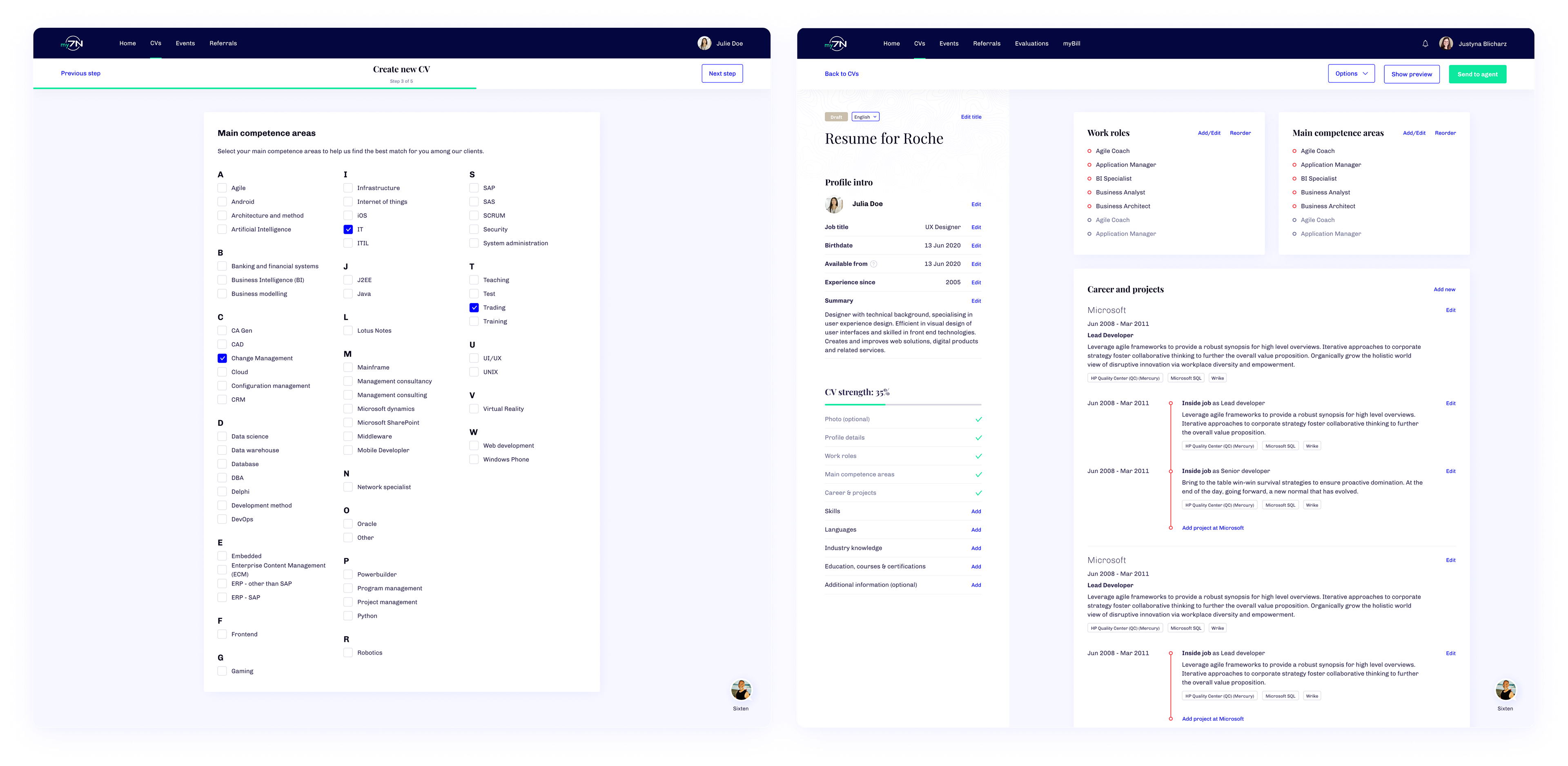
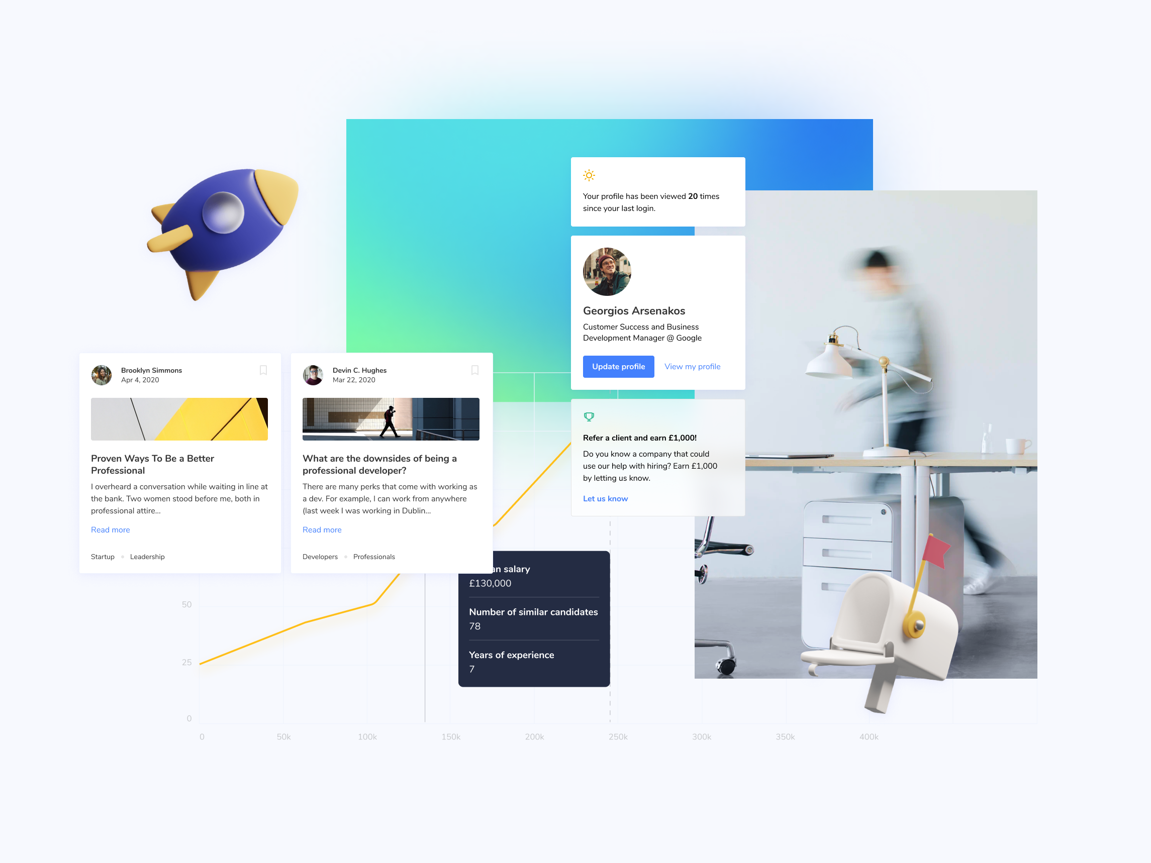
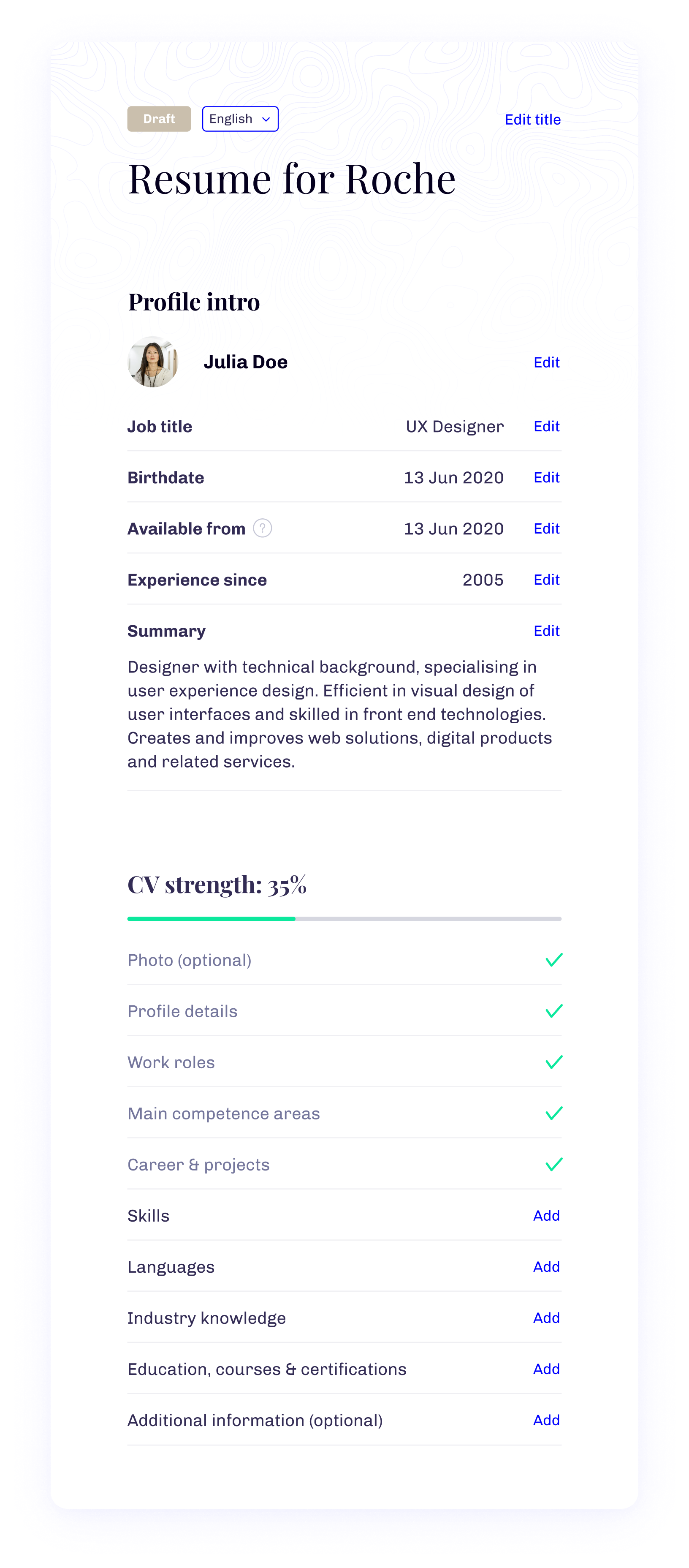
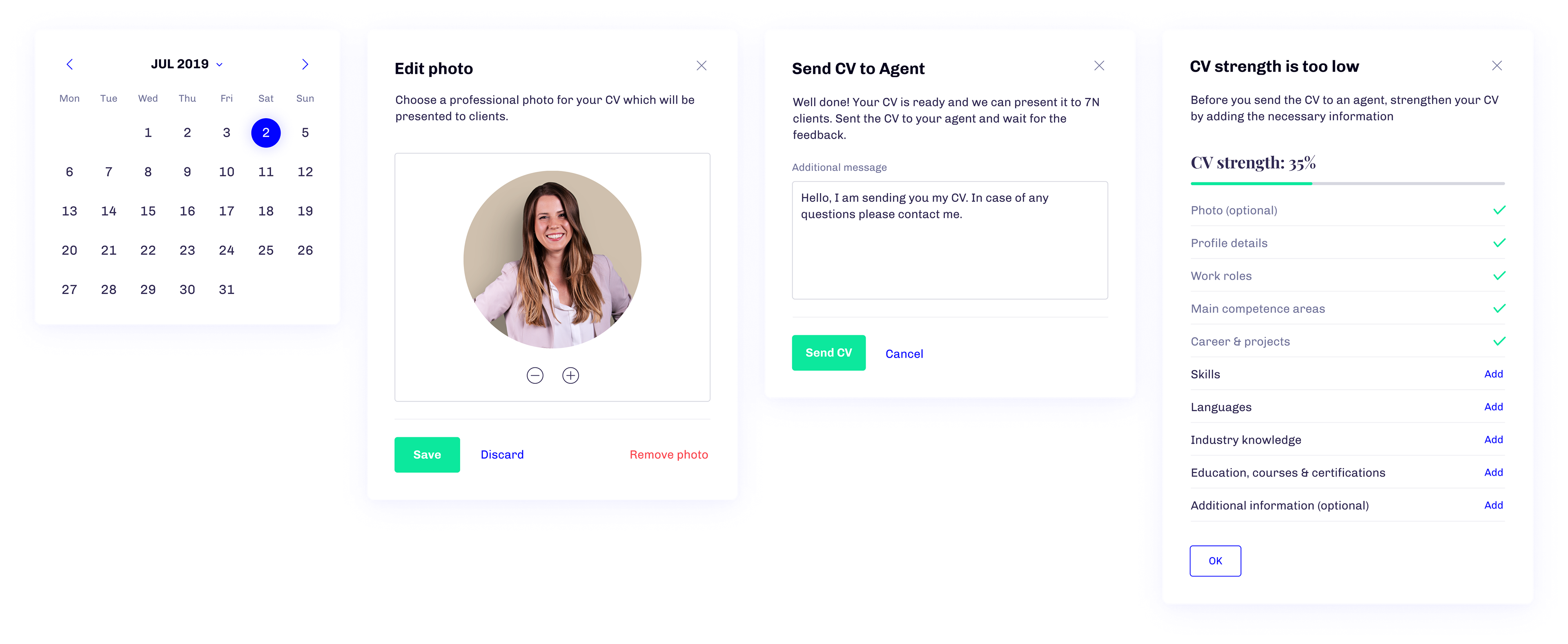
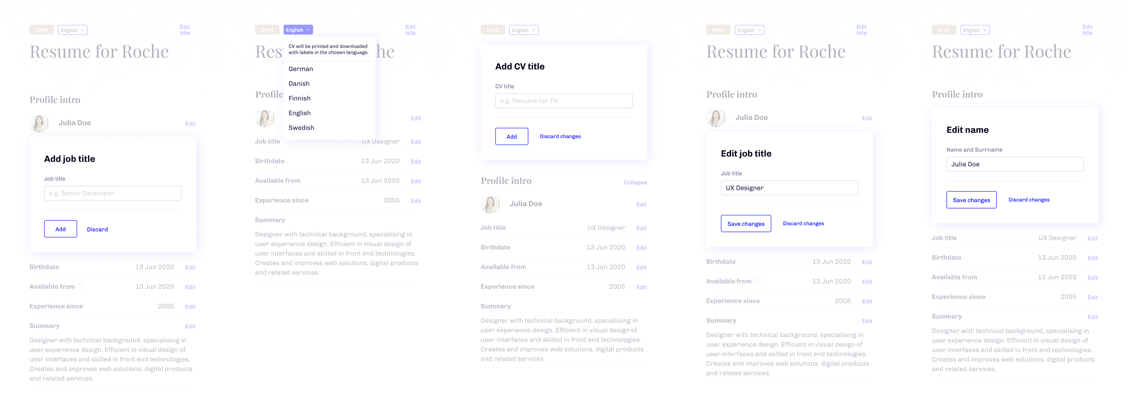
The prototypes for beta were constructed for CV System and User Management System (Power Tools). The MVP essentials.
User Creation Wizard and CV Creator received solid approval from the company and even received points from recruiters like “reducing the time for recruitment by almost half”.
For managers, the User Management System was not only a very welcomed update from the outdated Azure CRM.
User Creation Wizard and CV Creator received solid approval from the company and even received points from recruiters like “reducing the time for recruitment by almost half”.
For managers, the User Management System was not only a very welcomed update from the outdated Azure CRM.
The Closed Beta & first feedback
We were very lucky to receive the opportunity to present our platform to a closed audience. After user interviews and collecting feedback, the next in line was discussing what to update, change and make the timeline before open release. From my side, workshops would involve hands-on work and applying what was learned on UIs.
The visual flow of my7N didn’t require significant changes. Users addressed that contrast and spacing could use more time in the oven-overall reception was very positive.
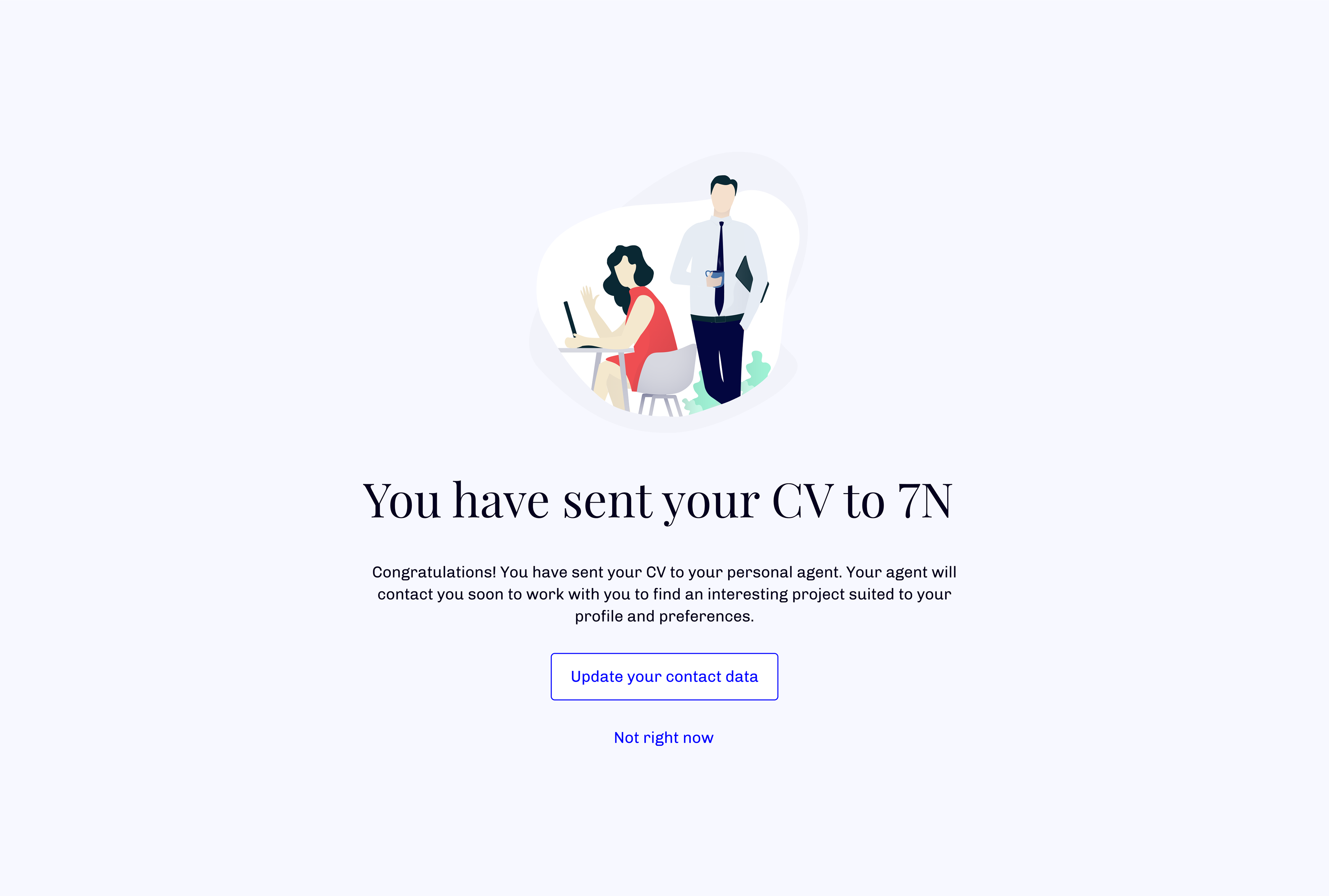
One of my favorite highlights from feedback was that the UI always provided good indication of he’s progress while performing complicated actions, like creating a CV profile.
The visual flow of my7N didn’t require significant changes. Users addressed that contrast and spacing could use more time in the oven-overall reception was very positive.
One of my favorite highlights from feedback was that the UI always provided good indication of he’s progress while performing complicated actions, like creating a CV profile.
The Open Beta 🥁
Wide release window, give us extra months before giving it to a wider audience. In long perspective, that was a blessing and the concept of beta provided us fantastic results.
During the time of testing and reviewing my work, my goal was to create an easy to use UI system in modern looking tools that will work untouched for at least a few years. So how did I manage to achieve that?
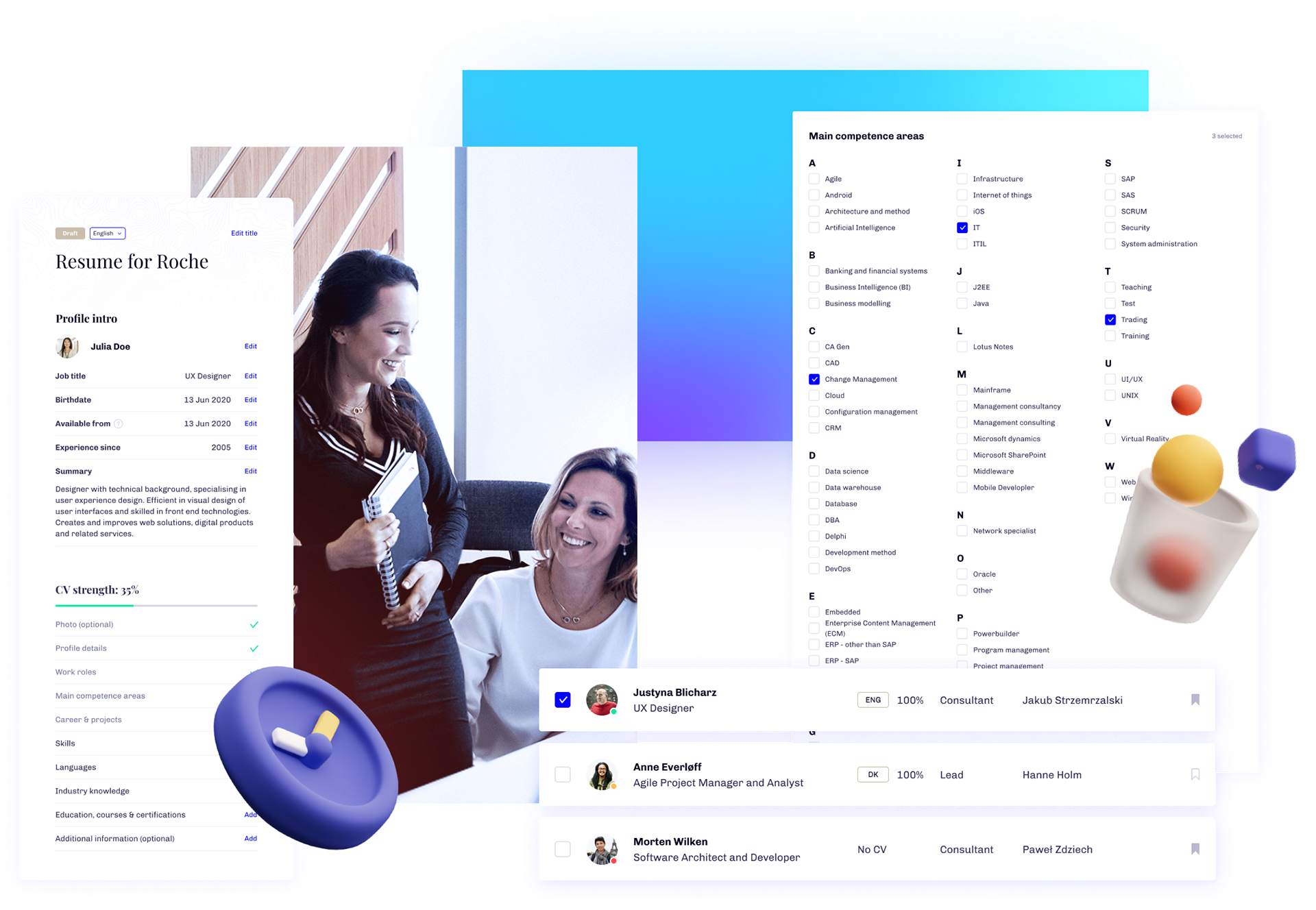
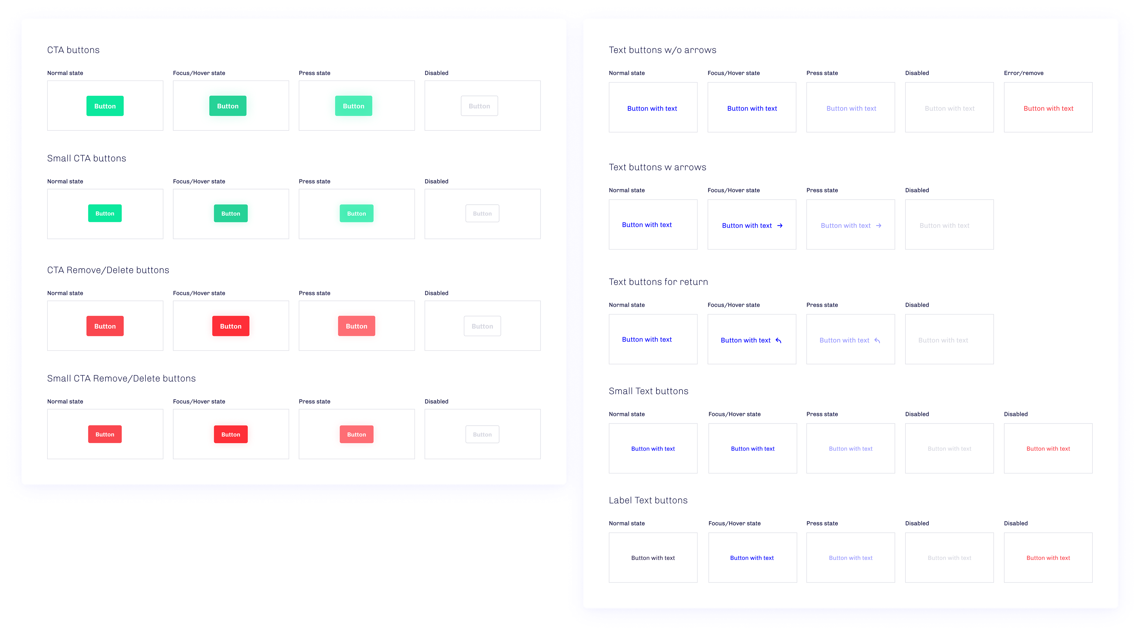
First step was to make all components scalable. To do that, I simply used Figma library functionalities and published a list of components in various states.
Part of it was to prepare patterns and present the guidelines on a handy website. As expected this part took over a month to complete. Over 30 unique components and over a 100 states were published. Upon request of the team, the library was ported to ZeroHeight website, so it was accessible for everyone in R&D team.
Tuning the Power Tools
The second step was making the tools for management and adjusting them to their work flow. Spacing, font sizes and even colour saturation were adjusted so after extended time of work, it won’t strain their eyes and muscle memory will come into play.
Brighten my day!
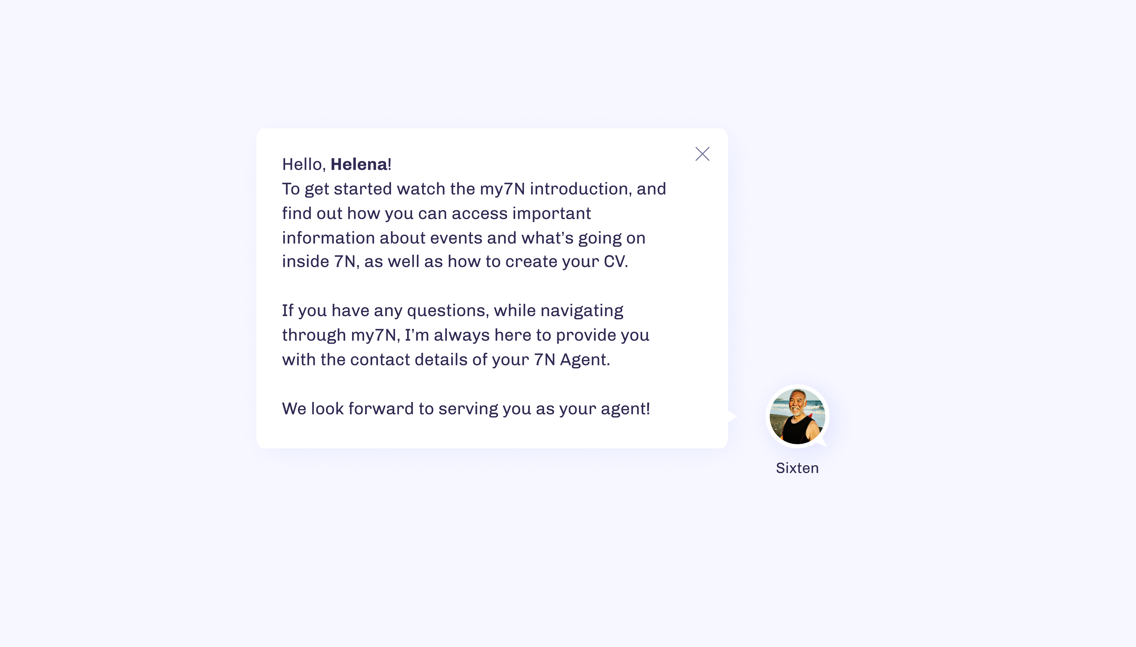
Third step (teams favorite) was to incorporate illustrations & animations to the website. They did bring a unique 7N flavor to the whole project. Not to drag, but all illustrations were custom made!
The Global Release 🎫
At the end of a scheduled beta, our team was delegated to kick-off my7N during the 7N Quarterly Event. Our team did a solid job showing off almost 3 year in a making project-with bright plans for the future.
Once the my7N platform went public, we made sure that the process of collecting feedback and user support were alive and kicking.
Once the my7N platform went public, we made sure that the process of collecting feedback and user support were alive and kicking.
Ask the questions that matters
Questions can be asked at any time throughout the chat. To ensure natural response users start the conversation with chatbot so questions they ask meet with quick responses. Questions are handled by delegated 7N staff members and sent to feedback inbox if needed.
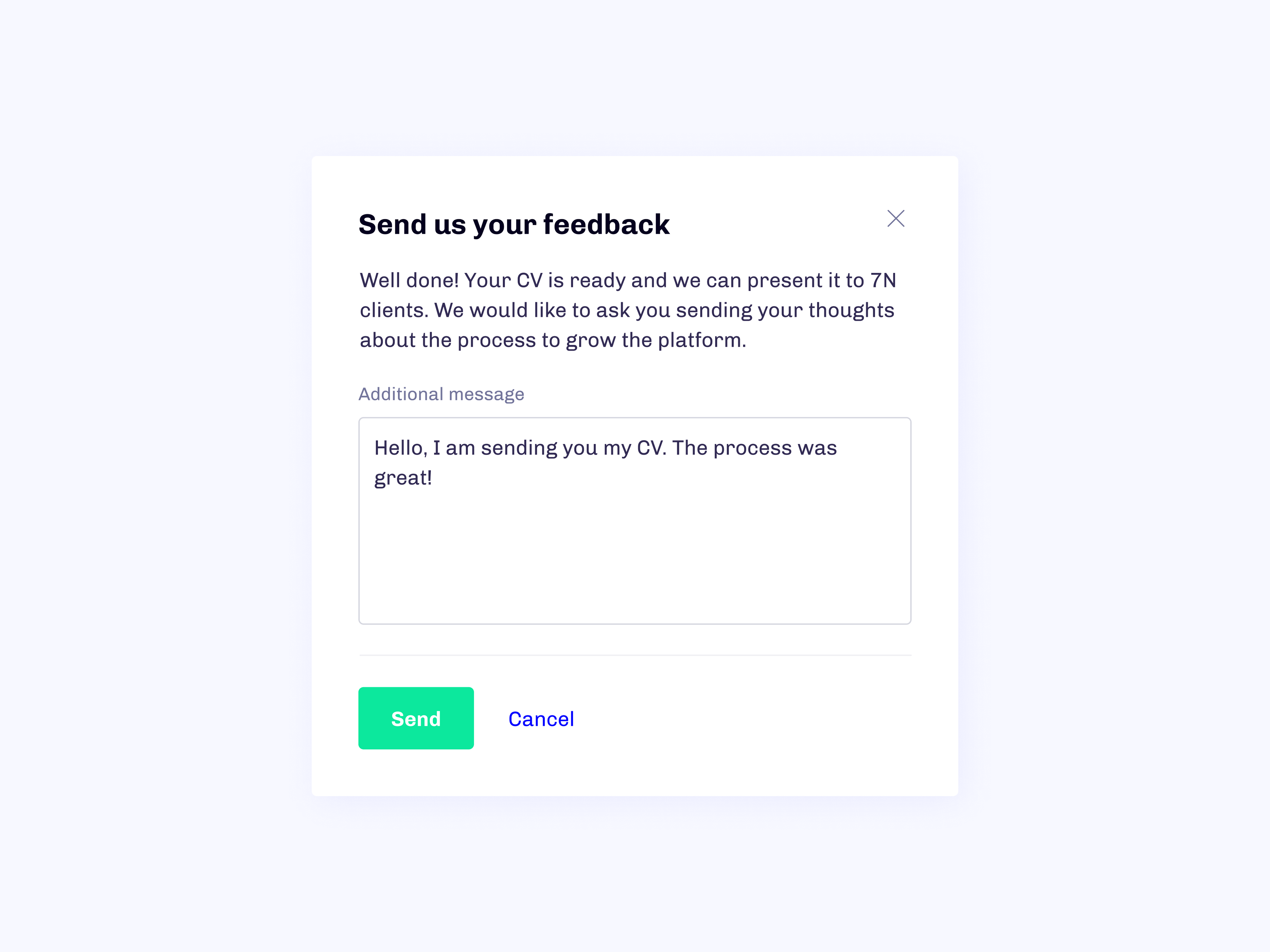
Send feedback
Once an activity of sending CV has concluded, participants are asked to consider giving feedback. This was meant to gather points for improvement and also get a pulse check on users' overall satisfaction with the my7N.
Don’t make me think
At every step of development we had users in mind. The process of creating profile, updating & editing was tested to decrease time spent logged on the platform. In addition, the system rewards users with smooth animations or relaxing other visual indicators.
The use of colors, fonts, shapes and visual feedback puts less pressure on users.
The use of colors, fonts, shapes and visual feedback puts less pressure on users.
Outcome & retrospective 🤔
Since this was my final project as a member of The 7N's Research & Development team, I left a part of my heart in it. I came into this place raw and left open-minded. This was where I learned to listen for empathy, hone in on my common sense, and where should I aim as a designer. I wasn't leaving without one final tribute.
On multi-product ownerships
In the beginning the project was met with a lot of time and resource constraints (we started with one developer and two designers, myself included).
Over the time span of 3 years we only scratched the surface with the CV System and User Management System. The list of features to implement was extending every month. There were days that we didn’t know what to focus on and decisions on hiring leads came a bit late into the life of the project.
We still managed to deliver the amazing product that meets and extends the exception of daily and new 7N users.
Mindset of a servant
One of the values of the 7N Company is “Mindset of a servant”. As weird as it might sound, it was a brilliant lesson on how to remove the “I” from the “Team”. It showed me how simple tasks like bringing coffee can help with better problem solving.
Not to mention that 7N had one of the best coffees in any office I attended, so it was a pleasure to make a quick cup of joe with friends.
Not to mention that 7N had one of the best coffees in any office I attended, so it was a pleasure to make a quick cup of joe with friends.
The rule of three
The way I solved tasks and delivered the solutions was inflected by the rule that you should always think in “three” as it is suggested by Sheth Jagdish in “The Rule of Three”.
This approach helped me provide my team with the quality and looking back–it was a great decision to make.
This approach helped me provide my team with the quality and looking back–it was a great decision to make.